
New ONS analysis shows that UK productivity has held up much better than previously thought. Here’s a quick Q&A including what this could mean for the Budget, and what it is telling us about Brexit…
This week the ONS published new analysis of the key measure of labour productivity, namely output per hour worked. This is one of the most important drivers of economic growth, living standards, and the public finances.
1. What’s changed?
In short, the ONS now has two headline series for output per hour worked. Both are based on evidence on the numbers of people in work and the average hours that they work.
The “current approach” is based on figures taken directly from a single survey, the Labour Force Survey (LFS), which is not very reliable.
This has now been supplemented by a new “component approach”. This uses the best data on jobs, workers and hours worked taken from a wider range of sources. The results should therefore be more trustworthy.
As this chart shows, the results are quite different, especially in the period between the Global Financial Crisis (GFC) of 2008 and the Covid pandemic of 2020. Between 2009 and 2019, annual growth using the component approach averaged 1.3%, compared to just 0.7% under the current approach.
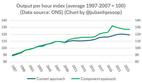
Taking the whole period between 2008 and 2024 – the latest year for which we have these new figures – output per hour grew by a total of 15.8% on the component approach, compared to only 8.7% under the current approach.
2. What’s behind the change?
The alternative sources suggest that hours worked have fallen by more than previously assumed. This is also the answer to the question of why stronger growth in output per hour was not reflected in stronger growth in overall output, incomes, or tax revenues.
There have not been any significant revisions to the ONS’s estimates of growth in output per job, or output overall. Instead, the mix has changed.
Compared to the current approach, the component approach suggests that people are more productive when they are working (output per hour is higher), but they are putting in fewer hours (average weekly hours are lower).
One (relatively rosy) way of looking at this is that people are taking more of the benefits of higher productivity in the form of additional time off rather than additional incomes.
3. Why have hours fallen more than previously thought?
The biggest single factor seems to be that people have been taking more days off as holidays, but the typical working week is now shorter too. The new approach is also better at picking up factors such as furlough and absences due to ill health.
More fundamentally, there are some underlying structural changes and trends which are likely to persist; an ageing population, more working parents, greater access to flexible working, and rising wealth, may all enable or encourage some people to work fewer hours.
4. What could this mean for the Budget?
Other things being equal, faster growth in productivity is good news for the public finances. But there may be offsetting factors, and next month’s Budget is probably too soon to expect any large forecast revisions for this reason alone.
Hours worked and output per hour are both important in forecasting potential output and hence the outlook for economic growth and the public finances. The OBR might conclude that in future, just as in the past, bigger increases in output per hour will be offset by bigger falls in hours worked, leaving potential output unchanged.
The OBR might also want more evidence before changing its productivity projections yet again, especially as the ONS’s new analysis is only complete up until 2024.
But the new data should still be helpful, whether now or in the future.
The OBR’s latest estimate for the underlying trend rate of productivity, at just 1.0%, is now lower than the ONS’s new estimate of 1.3% for the average between 2009 and 2019.
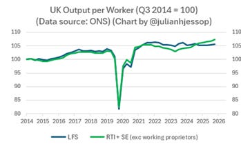
Moreover, the ONS has already been publishing some new productivity data based on alternative sources which are available up until the second quarter of 2026. As the green line in the chart below shows, these suggests that productivity has picked up further since 2024.
5. Has the UK’s “productivity puzzle” been solved?
Partially, yes.
The “productivity puzzle” refers to the slowdown in productivity growth observed in the UK, and many other countries, since the Global Financial Crisis of 2008. It is typically measured relative to the pre-GFC trend. As these two charts below show, that break is still there, but the divergence has shrunk significantly.
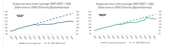
There is still plenty to explain, including the relative weakness of real wage growth. But the “productivity puzzle” is now much smaller than it was before.
What’s more, the new data suggest that the UK is no longer such a laggard on productivity growth since the GFC compared to other advanced economies. Sources differ, but the UK should now be in the top half of the table, rather than near the bottom.
6. What does this tell us about Brexit?
This leads to a final observation. Many have been quick to dismiss the relevance of the new ONS data to the debate about the economic impact of Brexit. I find this odd.
The decision to leave the EU is supposed to have had a large and negative impact on UK productivity. But this is now even harder to see in the actual data, in this case on output per hour.
Some Brexit pessimists have fallen back on other indicators which are not such good measures of productivity, notably GDP per head. Or they have repeated vague claims about a big hit to the overall trade intensity of the UK economy, which again is barely visible in the real world.
In my view, this is an extension of the familiar “confirmation bias” where any underperformance by the UK is immediately attributed to the decision to leave the EU, ignoring any other possible explanations.
Equally, any evidence which shows that Brexit has largely been a non-event in macroeconomic terms is automatically downplayed, including the latest data on productivity. That’s a shame, but ‘twas ever thus.

