
(Authors note: this article was written on 13th April. Obviously we’ve had more data since then, especially from care homes in the UK, but the main points all still apply.)
I’ve been doing a bit more digging into the data on COVID-19 deaths and some of the different ways to chart the progression of the new coronavirus. Mostly I’m just catching up with thinking already done by others, but hopefully this will still be interesting.
On Saturday I tweeted a link to a handy (if grim) tool produced by ‘Our World In Data’, which allows anyone to draw their own charts. I illustrated this with a simple chart of the total number of reported deaths per million people for a selection of European countries, including the UK (pasted below). On this metric alone, the UK has been performing less badly than some of its peers – but also worse than many others.
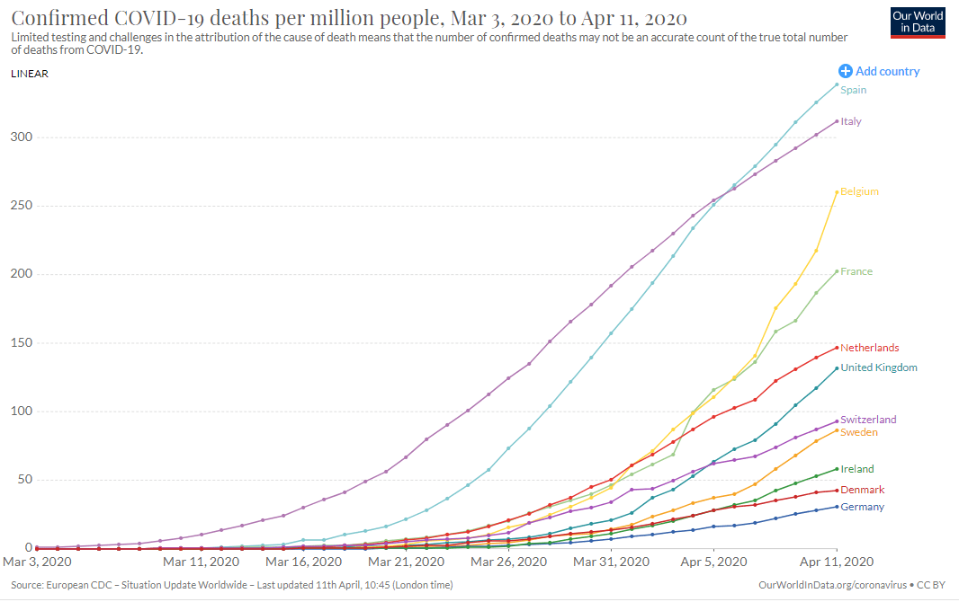
Of course, this isn’t a competition, and there is a tragedy behind every number. But it is still worth asking why such large differences exist and whether this chart is a sensible way to look at the data in the first place. I think I do now understand the issues better, especially around the role of population size, so here goes…
There seem to be four main questions: how reliable are the data on deaths? is population size a useful denominator? should we restart each clock from the first cases in each country? and should we chart the data in linear or log form?
1. How reliable are the data on deaths?
The data on the number of Covid-19 deaths are at least more reliable than those on the number of new cases or infections, which largely depend on the amount of testing taking place. But there are still many problems.
For a start, what is a ‘Covid-19 death’? Some people who have died after testing positive for Covid-19 may actually have succumbed to an unrelated condition, or were already receiving ‘end of life’ care. This might mean that the official data over-estimate the number of deaths actually due to Covid-19.
On the hand, some people may have lost their lives to Covid-19 without ever actually having been tested (especially in care homes). This would mean that the official data could be under-estimates, particularly in countries (like the UK) where there has been less testing.
The data published by each country will also vary according to their coverage and any delays in reporting. Indeed, there are big variations even in the UK data published by different official sources, as explained further by the Centre for Evidence-Based Medicine (CEBM).
In particular, the headline data reported daily in the UK only cover deaths in hospitals. A few other countries, notably France and Belgium, are quicker to start to include deaths elsewhere, especially in care homes.
However, it’s not clear how much difference this will eventually make, at least when comparing different countries. The ONS does publish comprehensive data for the UK, albeit only a weekly basis and with a long delay. In the latest available report, the great majority of UK Covid-19 deaths were in hospital (93%), with the remainder in hospices, care homes and private homes).
This proportion will fall sharply as more non-hospital deaths are certified and registered. (Normally, slightly more than half of all deaths happen outside hospital.) But it seems likely that a large number of Covid-19 deaths outside hospital will remain unrecorded, since people will not have been tested.
In addition, reporting delays also apply to hospital deaths. For example, the original count of 926 Covid-19 deaths in English hospitals as of 27th March has already been revised up by more than 80%.
Finally, though, it would be surprising if these delays are not a big issue in other countries as well – in addition to other measurement problems. For example, there are good reasons to think that Covid-19’s death toll is higher than official figures suggest in Italy and Spain too
In summary, the daily UK figures will surely underestimate the actual number of deaths due to Covid-19, perhaps substantially. Nonetheless, this is almost certainly true of many other countries too.
2. Is population size a useful denominator?
Intuitively, it makes sense to relate the number of deaths to population size for three reasons. First, the number of people in a country is obviously a crucial factor in determining how many might be expected to die from Covid-19.
Second, a given number of deaths (say, 10000) would be even more of a concern for a small country than a large one.
Third, countries with larger populations might also be more likely to have multiple outbreaks (or, put another way, more than one ‘patient one’).
However, in the early stages of an outbreak, population size may not be as relevant to tracking growth as you might think. Regardless of how many people live in the country as a whole, there are only a limited number that any one individual can infect, and the progression of cases (e.g. 1,2,4,8,16…) will be the same.
This means that countries with smaller populations will tend to report a higher number of deaths per million, at least until a larger proportion of the population has been infected, even if the outbreak is progressing in the same way.
Indeed, population size appears to be less important than population density in determining the progression of Covid-19. Think of it this way: you would expect a virus to spread more rapidly among six people in a lift than 60 people dispersed around a country park. Similarly, it is harder to maintain social distancing in crowded cities.
The upshot is that a country with a smaller population is naturally more likely to report a higher number of deaths per million in the early stages of an outbreak. And the deaths per million are likely to be higher still in countries with a small population size and relatively high population density.
Together, these factors might help to explain why smaller but more densely populated countries, such as Belgium and the Netherlands, have been reporting relatively high numbers of cases per million people. It might also help to explain why a low-density country like Sweden appears to be doing relatively well, despite not imposing a lockdown.
Similarly, the fact that New Zealand has one of the lowest population densities in the world – as well as its distance from anywhere else – may be just as important in explaining the low death rate there as the praise heaped on the tighter restrictions imposed by the New Zealand government itself.
Of course, these explanations can also only take us so far. Italy and Spain are both relatively sparsely populated, although their cases may be concentrated in regions (such as Lombardy) where density is higher. But other factors are clearly important too, such as the number of international visitors, or demographics and household types: in Italy in particular it is more common for elderly parents or grandparents to live with their families.
However, the main reason why Italy and Spain have so far seen the higher number of deaths may simply be that they were the first European countries to experience a significant number of Covid-19 cases. This leads on to the next question…
3. Should we restart each clock from the first cases?
A simple comparison of coronavirus deaths at the same date (e.g. 11th April) does not take account of the fact that different countries may be at different stages of the progression of the disease. The usual way to get round this is to rebase the data to start whenever the first cases occurred in each country.
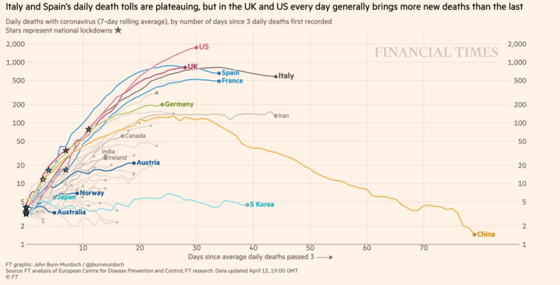
This is the approach taken for the regular visual updates provided by the Financial Times (hat tip to John Burn-Murdoch for setting the gold standard here). The latest version is pasted below (note this is of daily death tolls, not the accumulated total, and also adopts the log rather than linear scale which I’ll discuss next). The same style of presentation is used in the charts published by the UK government, and many others.
There are pros and cons of rebasing the start date in this way. On the plus side, it makes for a fairer comparison of what is happening in some countries and where others might be heading – and this is probably the most important consideration.
However, it is already pretty obvious from the simple timeline that the total number of deaths in the UK is likely to catch up to some degree with countries such as Italy and Spain. Less positively, any adjustment to the raw data risks losing some valuable information, such as the actual date at which certain numbers were hit in individual countries.
The fact that the outbreak started later in one country than another could also be important in itself. For example, a later start date might have given the health services of a country more time to prepare. Simply imposing the data on the earlier timeline of another country may then give a misleading impression that a particular path is somehow inevitable.
Finally, the adjustment method involves choices that could affect the results. For example, should you start each clock from the first case, or when daily cases averaged more than a certain number?
In summary, there is some value in looking at the raw data too, before making any adjustments. But rebasing from the start of the outbreak in each country makes good sense.
4. Should we chart the data in linear or log form?
It is also common to plot the number of deaths (the vertical axis) on a logarithmic scale (e.g. 1, 10, 100, 1000 etc), rather than linear (100, 200, 300 etc). This is often done for other data sets where there might be some sort of exponential growth.
One side effect is that this compresses the differences between the lines for different countries, maintaining the same ranking but making their performances look more similar. To illustrate this, here are the two charts of the latest data using either a linear scale or a log scale.


Personally, I can see merits in doing this either way. Just as when deciding whether or not to resynchronise the start dates, it depends what you are trying to show.
The log scale may well be more useful for comparing underlying trends, assuming this trend is likely to be exponential. However, it also loses a lot of detail, especially when the aim is to illustrate relative magnitudes. For example, the differences between a country with 100 deaths per millions and one with 300 deaths per million would show up more clearly using a linear scale.
I’d also emphasise the danger of crudely extrapolating any data to make forecasts about the total number of deaths. This is a particular problem in models where only a small difference in the inputs can make a huge difference to the outputs.
A particularly egregious example of this was the misuse of analysis by the US-based Institute for Health Metrics and Evaluation (IHME), which had predicted a final UK death toll of 66,000. This was seized on by some as evidence that the UK was likely to be one of the world’s worst performers. However, this approach was thoroughly debunked at the time, even before the IHME slashed its estimate to 37,000 just a few days later.
Unfortunately, there seems to be endless appetite for speculation about whether the UK might end up with the highest COVID-19 death toll in Europe, either in total or on a ‘per capita’ basis. The honest answer is that nobody knows. But looking at a wider range of charts might at least give a better sense of where we are now.

Another way to normalize the starting date of a “per capita” chart is by the time a fixed proportion of the population (say 3 ppm) is infected/deceased. Then curves of populations with the same rate of increase will overlap, so you can compare the effectiveness of mitigations fairly well.
LikeLike